Gioia
–
B R A Z I L I A N - C A F F È
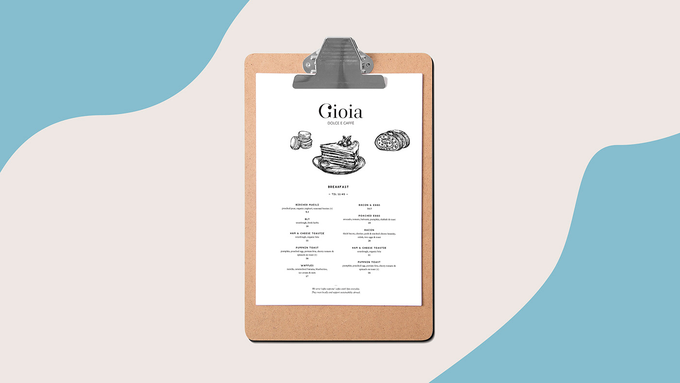
Gioia is a Café with a incredible space and wonderful sweets. Its name in Italian means "Joy", the main atribute of the brand. Gioia identity is highlighted by a elegant, serif typography.
After choosing the best direction, refining the final sketch and making optical adjustments, we did end up with a subtle and clean wordmark. The endings have also been adjusted to resemble chocolate drops, wich represents the quality of its products and the capital G becomes the brand icon for applications with reduced space.
After choosing the best direction, refining the final sketch and making optical adjustments, we did end up with a subtle and clean wordmark. The endings have also been adjusted to resemble chocolate drops, wich represents the quality of its products and the capital G becomes the brand icon for applications with reduced space.
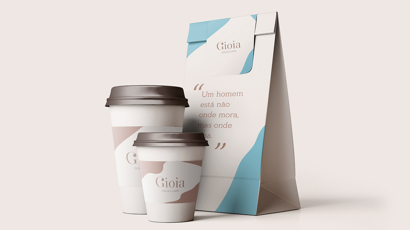
The colors helps conveying the sense of happiness and elegance of the brand, so the identity was created to work within different applications, making it possible to create a diverse line of handmade products.
The organic shapes were created to complement and give a unique presence to the brand, by creating a subtle reference to melted chocolate by applying the elements in hot foil in the packaging, giving elegance to the products. Subtly, each element begins to form the mosaic of information that helps to create sensory associations with Gioia.

